
 Welcome to The Friday Face-Off, a weekly meme here at Books by Proxy. Join me every Friday as I pit cover against cover, and publisher against publisher, to find the best artwork in our literary universe

![]()
The Screaming Staircase by Jonathan Stroud
Welcome to the Friday Face-Off where this week we’re comparing covers that feature a staircase.
The cover which immediately sprang to my mind was the first book in the Lockwood & Co. series by Jonathan Stroud, The Screaming Staircase; which, as luck would have it, almost always features a staircase!

![]()
Doubleday – UK Cover
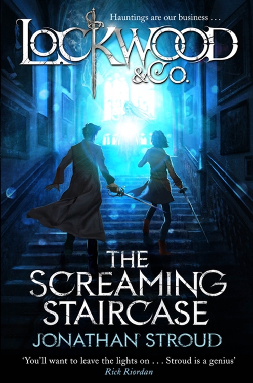
Cover Art by Alessandro ‘Talexi’ Taini
![]()
Disney / Hyperion Books | US Cover
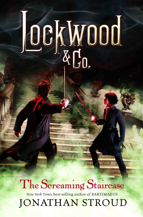
Cover Art by Alan Ayers![]()
| The Friday Face-Off: Winner |
I really love both these covers. They’re atmospheric, feature dramatic lighting and manage to express the tension of the illustrated scene.
The UK cover is dramatic and eye-catching, bathing the scene in an intense blue light, which casts shadows into the corners of the page. I love that the two figures in the foreground appear frozen in action as the eerie spectral figure appears at the top of the staircase, and that the typeface is clearly an integral part off the overall composition.
The US cover is simlarly dramatic but rather than using light, uses a thick green mist which clings to a staircase deep in shadow. The two figures appear primed to face battle, as an unsettling red light falls upon them and they hold aloft their weapons. Although I prefer the typeface on the UK cover, there is nothing to distract from the beautiful and bold illustration on the winning US cover.
![]()
Which cover wins your vote this week? Have a cover of your own? – Post the link below!
Amazon | The Book Depository | Goodreads
![]()
Next week’s theme is:
The only true wisdom is to know that you know nothing
A cover featuring something from Greek mythology
Remember to check The Friday Face-Off Feature Page for upcoming themes
![]()
| Links |
Lynn @ Books and Travelling with Lynn
Steve Smith @ Books and Beyond Reviews
![]()

What an excellent choice of book, Proxy:). It’s on my TBR list when I finally get around to sorting out the Kindle Fire I was given last year as I have an audible copy of this one. You’re absolutely right – both covers are awesome, but I do think the US cover just edges it – I love the red tinge and the fact they are about to engulfed in the yukky green cloud!
LikeLike
Great pick. Like you I can’t pick between the two. Both are eye catching in their own way.
LikeLiked by 1 person
I like both these covers but the green mist cover probably just beats the other – I think because of the way the characters are posed.
Lynn 😀
LikeLiked by 1 person
Yes, it’s quite dramatic! I love that green mist too. Very eerie – and I quite like not knowing why it’s there 😀
LikeLike
I think it has to be the UK cover for me. I love the blue light and how well it works with the spectre. I’m in the lighting buisness (theatrical, conxerts etc …) so always appreciate good lighting haha
LikeLiked by 2 people
It does look something like a stage set – and having a spectre does go very well with your name! It’s a shame the recent kindle edition doesn’t have the drama of these covers.
LikeLiked by 1 person
Proxy, I have not heard of this book so I can’t say which cover suits the book best, but I am definitely being drawn by that gorgeous blue to the UK cover. 🙂
LikeLiked by 1 person
I think I would be happy to have either on my shelf! 😀
LikeLiked by 1 person
I think I prefer the UK cover, but only because I like the color choice 🙂
LikeLiked by 1 person
The UK cover is lovely – it was hard to chose between the two! 😀
LikeLike
Both covers are good, but i agree with your choice. I think i just like the colours more 🙂
LikeLiked by 1 person
The colours create quite a lot of drama! It definitely is an eye-catcher 😀
LikeLike
Difficult choice, they are both very dramatic covers, but if I had to pick one it would probably be the UK one: the brilliant light coming from above looks very appealing to my SF-oriented brain… 😀 😀
LikeLiked by 1 person
It was a very close call for me – and I often end up changing my mind several times! – but the US cover just tipped it. I do love the lighting of the UK cover though, very eye-catching! 😀
LikeLiked by 1 person