
 Welcome to The Friday Face-Off, a new feature here at Books by Proxy. Join me every Friday as I pit cover against cover, and publisher against publisher, to find the best artwork in our literary universe.
| The Friday Face-Off: The Thousand Names by Django Wexler |
In this week’s Friday Face-Off we’re taking a look at the cover for the first novel in Django Wexler’s The Shadow Campaigns series, The Thousand Names. Despite having been on my to read list for quite some time, Wexler still hasn’t made it onto my bookshelf – a travesty which must be corrected at the earliest opportunity – so what better way to remind myself of what I’m missing out on than to ogle some wonderful book covers.
Awesome reviews and wonderful premise aside, just look at these babies! Swords?! Guns?! Vivid colours and incredible atmosphere?! What more could you ask for? With Del Rey and Steve Stone fighting in the UK’s corner and Roc with Paul Youll for the US, take a look and see which cover comes out on top!

![]()
Del Rey – UK Cover
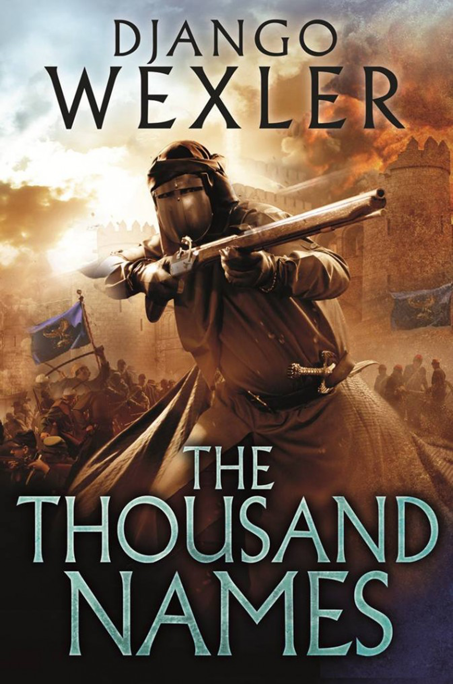
Artwork by Steve Stone

Roc – US Cover

Artwork by Paul Youll
![]()
| The Friday Face-Off: Winner |

This week was a tough one… so I’m calling it a draw! The more I look at the Del Rey cover by Steve Stone the more I love it. The composition is wonderful; the figure in the foreground has incredible dynamism; the background is chaotic and atmospheric; the colours are earthy but catch the eye; and it hits you with the impact of a movie poster. Overall an awesome effect.
The Roc cover on the other hand is more refined and elegant and it’s just as eye-catching as the Del Rey cover with its vivid use of colour and its own highly dynamic, yet entirely different, figure. I love the golds and the blue greens in this cover, and the overall composition is highly effective – in short: it looks like the kind of book I would instantly pick up.
But I still can’t choose a favourite. When it comes to dynamic action figures however, Steve Stone wins hands down. Love it.
![]()
Have you read The Thousand Names? Which is your favourite cover?

My favourite is definitely the one of TheThousand Names.
LikeLiked by 1 person
What a smashing idea:) I’m always intrigued at how different the UK and US covers are – and in this case I prefer the US one, as I think it’s more stylish. But whichever one – I HIGHLY recommend the book and the whole series. Wexler is a fantastic writer and this is a great read. Did you enjoy it?
LikeLiked by 1 person
Thanks! 😀 I love the US one too – you’re very right, it’s more refined and elegant.
I haven’t read it yet! This is a definite reminder to get a move on and get round to it. Very excited to do so 😀
LikeLiked by 1 person
I look forward to hearing how you get on when you’ve read it. It was one of my favourite series of last year:)).
LikeLiked by 1 person
I really like both of these covers but I just love the figure in the Roc cover. I don’t know why. I suppose I love the colours anyway but apart from that there’s something about the character. Even though you’re seeing his back striding away – he doesn’t look like he’s striding away – he looks like he’s striding into battle.
Lynn 😀
LikeLiked by 1 person
Oh definitely – looks like he’s about to launch himself into the fray! The colours are gorgeous, I love how it’s so vivid and then blends out into the surround.
LikeLike
I’m with you on this one. It’s a draw. The figures on both covers look like they mean business. Both covers would make me pick the book up. Definitely a draw.
LikeLiked by 1 person
Oh they definitely mean business!! 😀
LikeLike
It’s a draw for me too, though I find it interesting how if you look at the US covers of the series, the person on the cover starts with the back to the viewer then slowly turns to face front with each subsequent book 🙂
LikeLiked by 1 person
That’s really interesting! I love it when there’s a theme running through a series of covers.
LikeLike
Agree that this is a draw
LikeLiked by 1 person
I don’t envy you trying to pick a winner between these two great covers. I haven’t read anything by Django Wexler but either of these covers would tempt me to. I love the figure in the UK cover however I am also really drawn to the colours of the US cover!
LikeLiked by 1 person
They both have great aspects to them – and would both make me want to read them! That figure on the UK cover is awesome though, I just love it.
LikeLike
Even though I’m an American, I always seem to prefer UK fantasy covers. That goes for this novel as well.
LikeLiked by 1 person
I think generally UK covers hit the mark more often with me – and usually have better typeface if nothing else. This one however, I just can’t choose!
LikeLike