
 Welcome to The Friday Face-Off, a new feature here at Books by Proxy. Join me every Friday as I pit cover against cover, and publisher against publisher, to find the best artwork in our literary universe.
| The Friday Face-Off: The Name of the Wind by Patrick Rothfuss |
I’ve been feeling the Rothfuss cravings. The Name of the Wind was a spectacular début and, eight years after I first read it, I still wait with great anticipation for the third book in The Kingkiller Chronicles. So in this week’s Friday Face-Off we’re paying homage to this wonderful book by taking a good look at its covers.
Published by Gollancz in the UK and Penguin in the US, we have two entirely different pieces of cover art to compare. Take a look and see which one wins your vote.

![]()
Gollancz – UK Cover


Penguin – US Cover

![]()
| The Friday Face-Off: Winner |
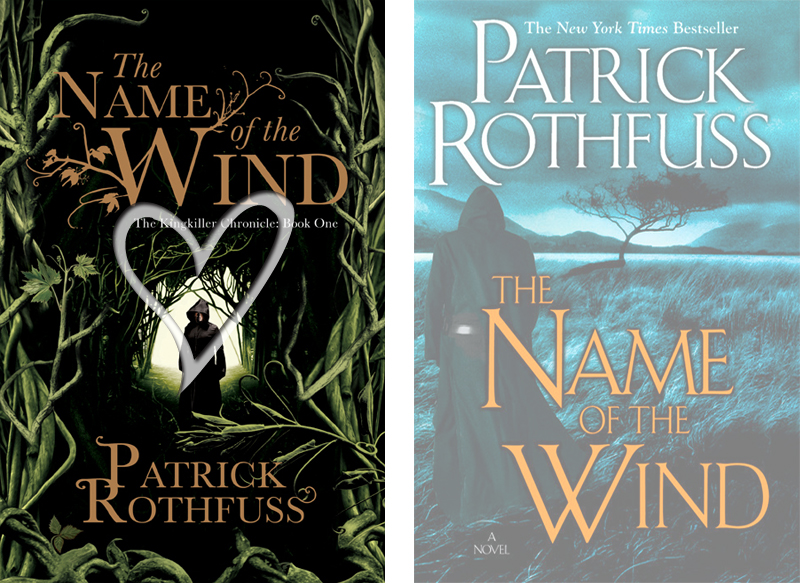
The Gollancz UK cover wins hands down in this week’s Face-Off. It’s dark and unsettling and I love those creeping and twisting vines which enclose the hooded central figure (who is also strategically placed in the centre of my heart – a rather disturbing prospect considering his bloody red eyes). Together with that beautiful and whimsical typeface, the entire composition makes for a wonderfully enchanting and rather sinister cover.
I’m a little bit disappointed by the US offering this week, a cover which was introduced for the fifth edition print of the book. The typeface does the composition no favours and, despite the darkened wilderness and the similarly sinister hooded figure in the foreground, this cover just fails to capture my attention.
Comparing the US edition to its previous incarnations I can certainly see the development of a darker and more atmospheric cover but it has a tendency, despite the hooded figure, to remind me more of a crime thriller than a fantasy epic. However, one thing is abundantly clear – Penguin missed a trick when redesigning this cover. Shirtless Kvothe is ridiculously entertaining and the incorporation of an angry and demonic Pat Rothfuss make for two very interesting and highly amusing pieces of cover art.

![]()
| The Name of the Wind: International Edition Bonus |
As I was rather disappointed with the US effort in this week’s Face-Off, I’ve decided to scour the globe to see what other beauties can be found. And this search has certainly turned up some good’uns – though no doubt I’ve missed some wonderful covers as there are a rather hefty number of translations! Take a look at some of the gorgeous covers the rest of the world has to offer.

From top left: Serbia, France, The Netherlands, Germany, Finland, Japan, Russia and Latvia
Choosing a favourite from this beautiful lot is nigh on impossible – the majority are simply stunning and vary considerably from country to country. The Serbian edition is particularly lovely though – the misty and mountainous backdrop with a lute festooned Kvothe in the foreground make for a beautiful and eye-catching composition.
The French edition follows closely behind the Serbian cover with a landscape bathed in golden light, a distant city and similar foreground Kvothe. Both the Dutch and German editions follow a similar line of thought but use a washed out, almost watercolour backdrop and the typeface, though different, is equally beautiful on each edition.
The Finnish version has a wonderfully folkish cover whilst the Japanese offering is bold, vibrant and showcases Kvothe’s flaming red hair. The Russian edition is an entirely different affair, displaying some beautiful fantasy imagery, and the Latvian cover is bold, vibrant and gives us a defined Kvothe doing what he loves best. Altogether, a rather impressive display of artwork.
![]()
Which is your favourite cover? Do any of the alternative editions take your vote?
