

Welcome to The Friday Face-Off, a weekly meme here at Books by Proxy. Join me every Friday as I pit cover against cover, and publisher against publisher, to find the best artwork in our literary universe. Check out Lynn’s-Books for upcoming themes!

![]()
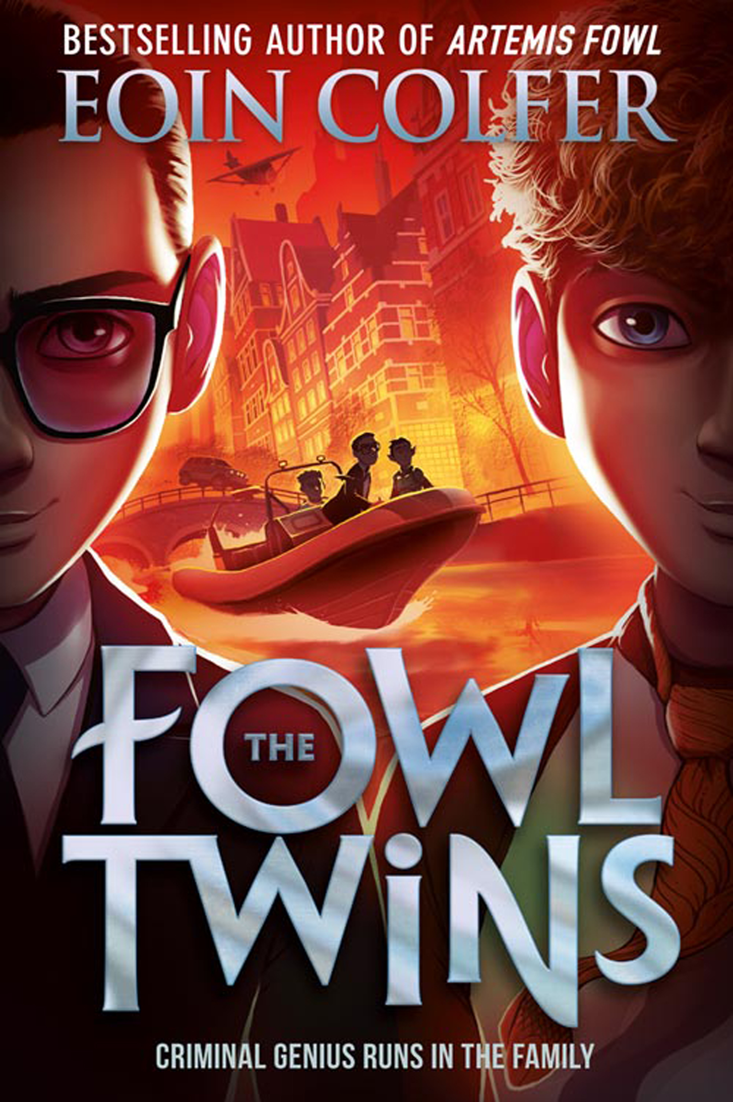
The Fowl Twins by Eoin Colfer
Welcome to the Friday Face-Off where this week we’re comparing covers featuring glasses!
While there are a fair number of obvious choices to go for, or books with only one cover to choose from, it was much more difficult than I thought it would be to find a worthy comparison within the realms of science fiction and fantasy… but I really should have started looking at children’s book sooner!
This week we’re comparing The Fowl Twins by Eoin Colfer, published by Harper Collins in the UK and Disney Hyperion in the US. Take a look and see which one is your favourite!
![]()

![]()
Harper Collins UK | Cover #1

Disney Hyperion US | Cover #2

![]()
| The Friday Face-Off: Winner |

Both these covers draw the eye. The smouldering sunset of the UK cover, the focal point between the two, staring faces and the overall composition works really well. The typeface is punchy but clean and doesn’t draw the eye away from the illustration.
The swirling colours and chaotic action of the US cover makes for a beautiful piece of artwork where the characters almost leap from the cover. The only negative being the rounded, shiny typeface that distracts a little too much from the overall composition.
I can’t possibly choose between them…
![]()

Cover Art for Artemis Fowl by Goñi Montes
![]() Which cover wins your vote this week? Have a cover of your own? – Post the link below!
Which cover wins your vote this week? Have a cover of your own? – Post the link below!
Amazon | Book Depository | Goodreads
![]()
Next week’s theme is:
Hubble Bubble
A cover featuring potions
Remember to check Lynn’s Books for upcoming themes
![]()
| Links |
Steve @ Books and Beyond Reviews
Kristi @ Confessions of a YA Reader
![]()

I like the HarperCollins far better, with the cleaner, somewhat more realistic touch. The other one is too psychedelic for my taste.
LikeLiked by 1 person
Oh yes – psychedelic is definitely the word! I really like them both! 😀
LikeLiked by 1 person
While I like the US cover – I LOVE the Harper Collins offering. But then, I’m always a sucker for those glorious glowing colours… Great choice for this week’s theme, which has thrown up some really fascinating books, Proxy:)).
LikeLiked by 1 person
Thanks, Sarah! I honestly couldn’t choose between the two – especially after seeing the full collection of new covers from Disney Hyperion! 😀
LikeLiked by 1 person
It was a really close-run thing. When you have two such strong offerings, it has to be a question of personal taste.
LikeLiked by 1 person
I like the Harper Collins UK one the most. The one with the reddish background. I love reading middle grade and young adult books, but sometimes I wish I was a bit younger. Some books are just really aimed at a younger audience. Eoin Colfer’s books fall in that category. Kids at school love it!
I did a Friday Face-off again, here’s my link: Weekend Book Friends
LikeLiked by 1 person
I started reading them at the end of primary school and absolutely loved them! I’m not sure if I’d get the same joy out of them now though… they’d be good but not the same!
LikeLike
I can’t choose either! Both are different enough that there are different things I like. I love the close up half faces on the UK cover, but i also love all the crazy stuff happening on the Disney cover😁
LikeLiked by 1 person
I wish the Artemis Fowl books had these covers when I was younger! They seem a bit bland by comparison now. I remember there were glyphs on the title sheet and to the top and bottom of every page that I spent a lot of time decoding during a summer holiday on a narrowboat 😂
LikeLike
I couldn’t choose either 🤣🤣 They are both very appealing.
LikeLiked by 1 person
They are indeed!! 😀
LikeLike
I was going to say, before I even saw your verdict, I don’t know how I could personally choose between the two, they’re both awesome! Glad I’m not alone 😀
LikeLiked by 1 person
I wish my old covers were as pretty as either of these! 😄
LikeLike
Absolutely agree – so difficult to choose that I kept changing my mind. It has to be an even split.
Lynn 😀
LikeLiked by 1 person
I kept changing my mind too! In the end I just couldn’t choose 😄
LikeLike
I honestly love all these covers!
LikeLiked by 1 person
They’re fab, aren’t they?! 😀
LikeLiked by 1 person
🙂
LikeLiked by 1 person